An ugly truth: your book will be judged by its cover.
That’s not easy for authors to hear. We’re focused on the story. We invest weeks, months, or years of out lives in crafting a tale we want to share with the world. And yet, whether readers shop online or in bricks-and-mortar stores, their first impression of our book will be formed in milliseconds — when they encounter the cover.
I know this better than most authors. When my first book was published in 2004, (Putting the Tarot to Work, a book on using Tarot cards for visual brainstorming cues), I pushed the publisher to go with an unconventional choice: an acid green cover featuring a gleeful, cigar-wielding character straight from 1980’s movies about getting rich quick.
I loved the tension between the overt capitalism and a metaphysical topic, and thought people would dig the irony.
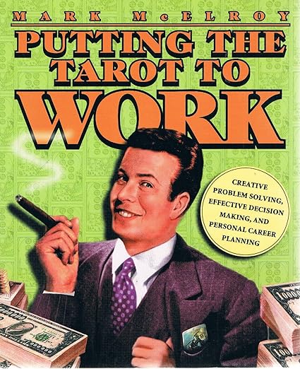
They didn’t. The target audience (women between 35 and 55 with metaphysical interests) really hated that cover! (They tried to tell me. I didn’t listen.) Despite good reviews, the book floundered … mostly because of the cover.
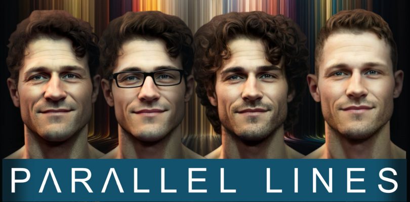
Twenty years later, when it came time to create a cover for my first novel, Parallel Lines, I didn’t want to repeat the same mistake! So here’s the story of what guided my choices as I created the cover … and what I learned along the way … just in case my experience can inspire or help you as you make choices of your own.
Be sure you want to design your own cover.
Graphic design is a bit like writing a book: everyone thinks they can do it, but few people really have the time, expertise, or training for it.
I have more than three decades of graphic design experience, some marketing and branding expertise, a proficiency with professional digital art tools, and some hard-earned wisdom from having gotten cover design wrong in the past. Even so, I hesitated to design my own cover. (But ultimately, I did.)
If you have graphic design experience, by all means, design your own cover! But if not, please consider commissioning a cover design from an artist who is used to designing appealing, well-balanced cover art. You’ll save yourself a lot of time and heartache … and your book will be the better for it.
Fiverr.com is not a bad place to start reviewing portfolios: just search “book cover design.” (And be aware that many vendors advertise cheap packages with no frills … when, as we’ll see later, you probably want some of the frills!)

Canva.com will also generate book covers. The service provides a ton of templates (a good starting place, especially if you’re uncertain about your own design skills). Pick a template, change the title, change the supplied photo, pop additional photo elements (people, moons, crosses, crowns, etc.), choose a special effect (artistic blurs, etc.) … and you’ll have a custom cover.

The downside? Even though templates are very customizable, other people could make similar choices, increasing the chance you’ll create a “look alike” cover. (It’s also true that, will all the customization options, total beginners can make some spectacularly bad choices, despite Canva’s help.)
So: maybe you’ll try to DIY your cover. Maybe you’ll hire an artist! (I recommend doing so, by the way.) Either way, you can use the lessons I learned to guide your work with the artist you hire.
Don’t use a generic cover.
Amazon.com will happily let you “create your own cover” by selecting a color, a font, and a pre-set arrangement of text. This is quick and easy … and the results are pretty generic. Readers can spot these generic covers from a mile away.
It comes down to this: do you want your readers’ first impressions to be generic … or specific and unique? Do you want your book to fade into the background … or stand out?
Your friends and family can look past a generic cover. Most readers out there in the Great Big World will not.
Instead …
Play to the expectations readers bring to the book.
Parallel Lines is a gay romantic comedy with science fiction (alternative worlds, time travel) elements. So: I went to Amazon and looked at about fifty covers for gay romcoms.

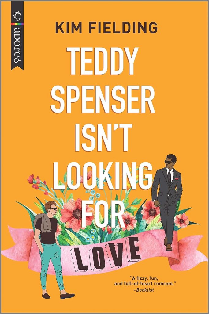
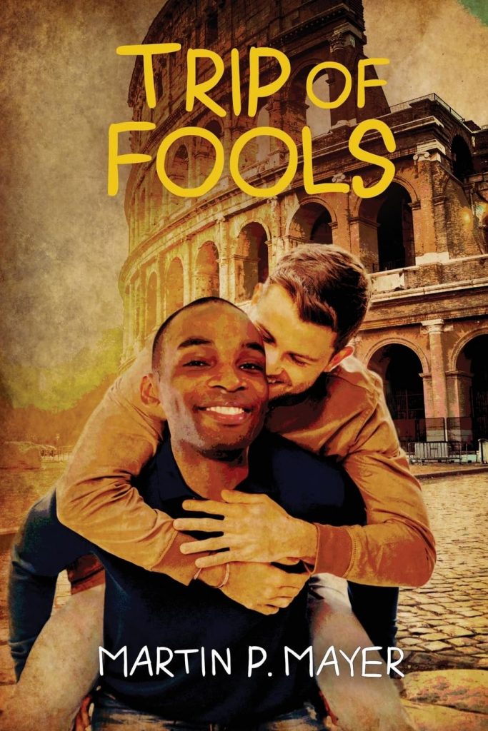
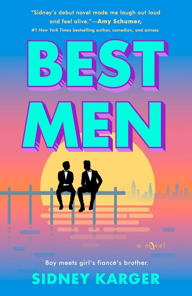
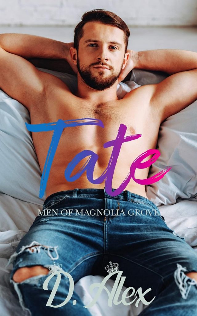

Most gay romcoms have a guy on the cover. Depending on how florid the novel is, the guy will either be handsomely attired (if the book is tamer) or showing skin (if the book is wilder).
Because of previous experience with cover designs that subverted reader expectations, I was absolutely going to have a handsome guy on the cover of this book. (My guy wouldn’t be showing as much skin as “Tate” does, though!)
If you’re working with an artist to design your cover for you, you should still do this homework, as it prepares you to critique the artist’s ideas with market trends (and not just your own preferences) in mind.
Think about the content of your book.
Art on the cover should illustrate — concretely or symbolically — the content of your book.
If this is done well, the cover will communicate enough to draw readers in … and conceal enough so that readers, upon finishing the book, see the cover as a satisfying summary of the experience they’ve just had.
In short: you need to identify key people, moments, objects, or themes … and be sure the cover art represents those in an engaging way. (Working with an artist? Doing this homework ahead of time will save you time and money.)
For reasons discussed above, I had already decided I wanted to feature Thomas on the front cover of Parallel Lines. (Early on, I also wanted to show Ed, Anna Denise, Les, Warren, Hope, and Leo on the cover — but I set this idea aside early on, after beta readers told me they preferred imagining how the characters look for themselves.)
In the novel, Thomas uses a stolen technology (which looks like a polished silver sphere) to jump from world to world, and he encounters this tech in the basement of a midcentury modern lake house — a setting he returns to again and again, in every parallel world he visits.
Those spheres struck me as a strong graphical element, as did the lake house: so I knew I wanted those on the cover, too.
And, of course, since the book has been written primarily for LBGTQ+ audiences, I wanted to work in a rainbow motif … without simply slapping a rainbow or a rainbow flag across the cover.
Consider several concepts before choosing one.
Book covers come in an insane variety of artistic styles and graphic designs. Even if you like the very first thing you see, you should probably consider between three and five designs before making a choice. (Working with an artist? Request at least three concepts to review.)
In my case, I decided to use Midjourney, an art generator powered by artificial intelligence, to explore ideas for my cover design. My goal wasn’t to have Midjourney create the cover! Instead, I wanted the AI to give me ideas that I might develop further on my own.
Just for fun, I started with a very basic prompt: “Simple book covers for a novel called Parallel Lines, about a man living in parallel worlds.” Here’s the result:
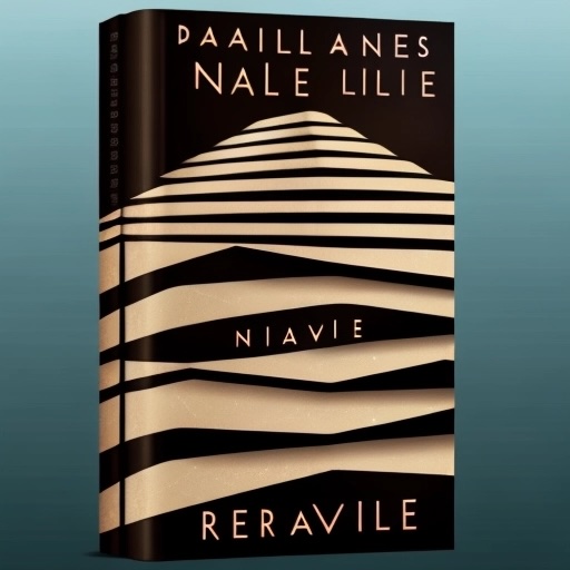
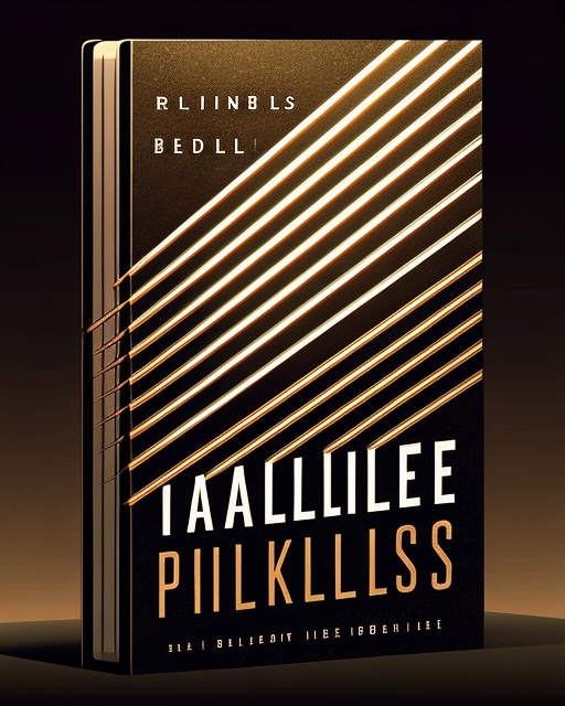

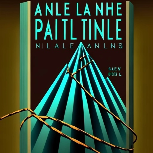
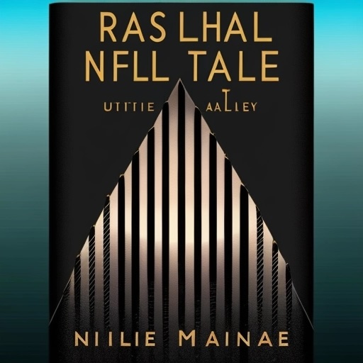
Some of these were interesting, but they struck me as being too generic and too divorced from the brainstorming I’d done earlier. I decided to focus on some elements from the story, beginning with the silver spheres (or “Tangential Route Generators”) that play a key role in the book. I asked Midjourney to give me different versions of “silver spheres and parallel lines,” getting results like these:


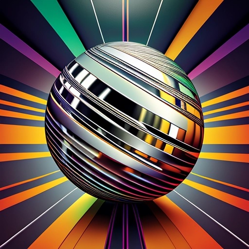


Hey, some of those are very interesting! Over time, I got closer and closer to something I liked by asking for “silver spheres in a dimensional vortex:”
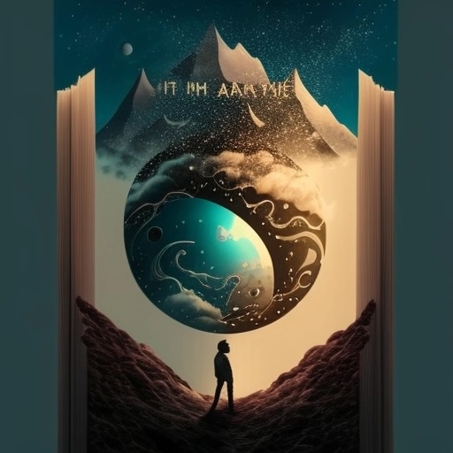


One of these — the first one here — featured a character beneath a floating sphere that suggested multiple worlds. While it wasn’t the image I wanted to use, I made a note of the composition.
And finally when I saw this version of the sphere, I knew it was the one I wanted to use:

The idea of rainbow colors expressed as parallel lines appealed to me, so next I wanted to create an energetic backdrop based on this idea. I got these results:


I loved the second one, and knew I’d want to use something like it in my final image.
In Parallel Lines, Thomas visits four different “tangent universes” and inhabits four different versions of himself. In each universe, his body is slightly different. (For example: in one world, he’s more heavy-set and out of shape. In another, he’s ripped.) It occurred to me I could show four different versions of the same man on the cover … so I asked Midjourney to show me “book covers for a novel called Parallel Lines with four slightly different versions of the same man on the cover.”
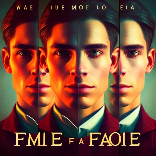

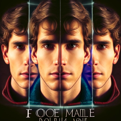
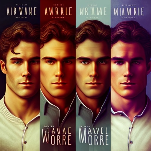
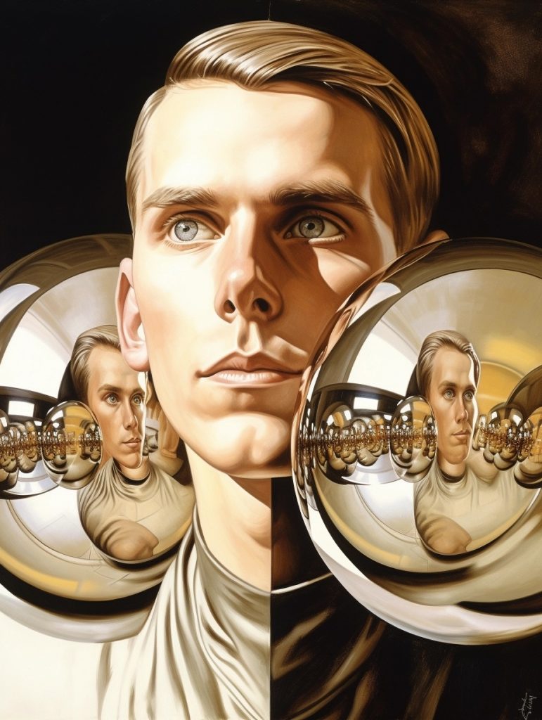

Hey! Now we’re getting somewhere! There was something I liked about the third image, so I saved it for inspiration.
Of course, I didn’t want just any guy on the front cover: I wanted Thomas, my main character. I knew how Thomas looked, because I’d mocked him up earlier, using a combination of a character created by Midjourney and some Photoshop work combining that model with some elements from people I’ve photographed in the past:

I fed Midjourney Thomas’s photo and tried asking for versions of him at varying weights. Yikes! The results didn’t please me at all:


So, in the end, I took Thomas, isolated his portrait on a black background, and used Photoshop and Face App to create several versions of Thomas: with glasses, with a few extra pounds, with a fresh haircut, etc. I really liked these.

By this time, I had a pretty clear idea of the cover I wanted. Still, I wanted to see some things that were completely divorced from my emerging expectations, so I asked to see covers based less on characters and more on events from the book. The story takes place in Atlanta, so I looked at covers evoking Atlanta, spheres, and parallel lines:
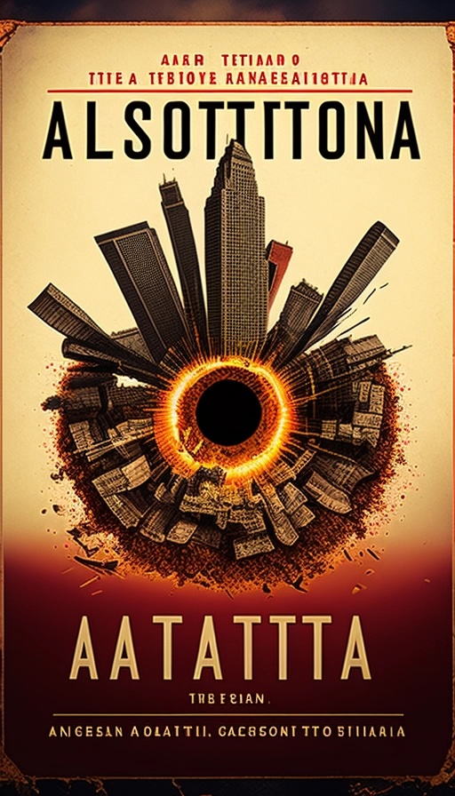


Meh. Hey — one big feature of the story are these awful dimensional vortices that appear and cause a tangent to collapse. How might those be worked in?

Hey, how would the vortex idea look rendered as Japanese paper art?

(Actually, some of these do a nice job of balancing components from the story with what feels like a sense of fun.)
Oh — I also needed that lake house, right? So I played with lake house images:

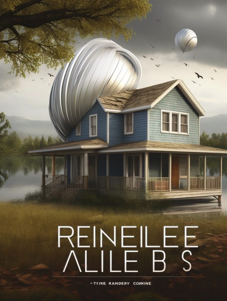


It took several sessions, but I finally got a version that felt right.
Midjourney and programs like it will keep coughing up images as long as you keep asking for them, so if you’re not careful, you can doodle too much time away. So: now that I had lots of inspiration, I began piecing together a cover based on the elements I liked best: the cascade of rainbow lines (suggesting parallel worlds), the sphere, the four versions of Thomas, and the lake house.
I assembled these into a size and shape suitable for a book cover, then added a title treatment based on a simple san-serif font (with the cross bars removed from the A’s, just to give the words a science-fictiony flair). Here’s the result:
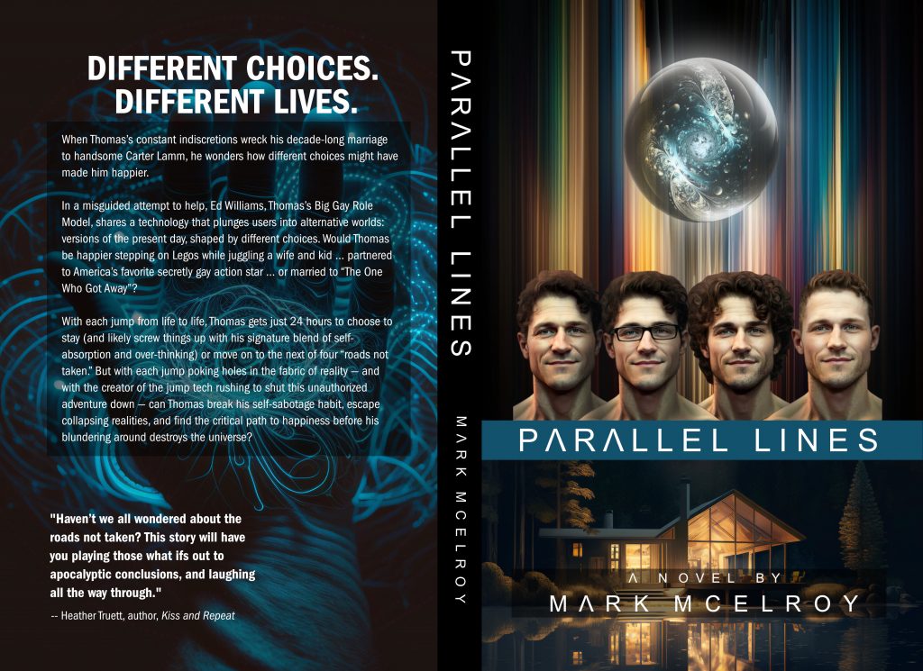
This cover, inspired by Midjourney, incorporates elements I tweaked, altered, and collaged together to create something new.
Of course, you don’t have to have draw your inspiration or get elements to remix from Midjourney (or any other AI-based program). The easiest way to collect inspiration is to go to Amazon.com or your local bookstore, find books similar to yours (or in the same category) and study them.
What color palettes occur again and again? What elements do you see that you like? What covers caught your eye, and what do they have in common? How might the style of a given cover be adapted for use in your own book’s cover?
The notes you take during your research can be of great help to you — or to the artist you hire — so snap photos of covers with your phone and take good notes!
Get feedback.
I knew I’d done something right when one of the beta readers said, “Hey, that’s the lake house, exactly as I imagined it!” When another said that this incarnation of Thomas made him “sweat in all the right ways,” I was doubly happy.
So far, all comments received from people in the target demographic (LGBTQ+ persons between 35 and 65 who read gay romance, comedy, and sci-fi) have been overwhelmingly positive.
I also compared my final version to my original brainstorm. I had hoped for a cover that would represent the handsome main character, the alternative worlds theme, the sphere, and the lake house in an attractive and appealing way. Check, check, check, check!
Use caution when depending on art generated by artificial intelligence.
This post would be incomplete if I didn’t add a word of caution about using AI to create your book cover.
First: given how most AI’s were trained, ethical questions linger about using their work, which may incorporate elements of a human artist’s work without that artist’s permission. Because ownership rights remain unclear, I don’t like to use AI-generated art directly. Instead, I draw inspiration from the AI’s output, harvest elements from it, alter them further in Photoshop, and use them to create something new … and distinctively my own.
That point’s important, because copyright law currently holds that AI art can’t be copyrighted (because a human didn’t create the work). By sampling, altering, tweaking, and remixing the AI’s output, I make sure that the art I create is uniquely my own.
That point’s also important to keep in mind when hiring someone to create your book cover for you. Currently Fiverr.com and similar services are jam-packed with individuals offering to provide book cover art for ridiculously low prices … and when I reviewed their portfolios, I saw a lot of AI-generated art.
If your cover artist is doing nothing more than generating a quick cover using an AI art service, that cover can’t be protected by copyright. If an unethical person chose to knock off your cover for their own book — putting out a different story, but using your title and artwork — you might have trouble claiming that cover should be considered uniquely your own.
Keep pristine, well-organized copies of the final files on which your cover is based.
Ebooks, paperbacks, and hardbacks all have different cover formats that vary in terms of resolution, size, spine width, and structure. You’ll also want to use your cover art in advertisements, in banner ads, on flyers, on bookmarks, and on promotional materials — and all of these will vary in size and shape, too.
Because I have the individual Photoshop files on which my cover is based, I can mix and match those elements into documents of every conceivable size … making it easy to produce whatever covers or collateral I want.
When working with a cover artist, you should absolutely expect to receive custom-made book cover images, made to your publisher’s exact specifications, in high-quality .jpg (300 dpi minimum) or .pdf files.
But you should also negotiate to receive the Photoshop files on which these images are based! Owning those files guarantees you maximum flexibility now and in the future.
You might, for example, be creating a series … and if so, you might want to recycle certain graphic elements from this first cover as a way of giving the series a unified look and feel. You can’t do that very easily if you don’t own or possess the files used to create your cover.
Don’t trust the original artist to keep up with or retain those files on your behalf! If you own the art, you can rework it with any artist or designer in the future.
Designing your own cover is a lot of work.
If you ignore my advice and design your own cover, keep in mind that doing so is a lot — a lot — of work, especially if you do it well.
In my case, I trolled Midjourney for inspiration on and off for a period of four weeks. I probably then spent two full working days creating the first mock-up of the cover, including one used only on the ebook versions I gave to beta readers.
When the time came to create the publication masters for ebooks, paperbacks, and hardbacks, I spent three additional days remaking the mock-up from scratch (swapping out the images of Thomas for better ones, tweaking color, and enhancing resolution). Then, because the ebook, paperback, and hardback editions all have different cover requirements, I spent an additional day cranking out three different versions of the master file.
If you have the skills, talent, and time to do it, making your own cover is fine … it’s just not something you should plan to do one Saturday afternoon.
Looking Back
In retrospect, I think the cover I’ve created is … pretty good. Not great, just pretty good.
RomCom covers tend to have brighter color palettes — bright yellow, pinks, blues. My cover’s a bit dark for a romcom, and perhaps too influenced by my passion for the science-fiction elements in the novel.
Also: not much about this cover says, “Comedy!” does it? I may have leaned into the sci-fi (and even the spiritual) angles of the story too much.
We’ll keep an eye on sales and feedback. Maybe six months from now, I’ll be writing about how a bright, funny new cover helped this book connect better with its audience!
How you can help.
If you enjoyed this post, or if reading about Parallel Lines has made you want to read Parallel Lines, please consider picking up a copy from Amazon.com. I’d be very grateful to you.
On November 28, 2023, Parallel Lines will be available as an ebook, a paperback, and a hardback. You can find out more on Amazon.com or on the book’s homepage. Curious as to whether this particular gay romantic comedy with science fiction elements is for you? You can read sample chapters here.

